折线图
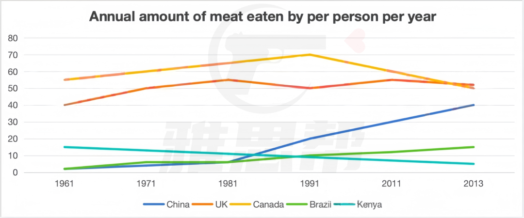
The graph below shows the annual amount (kg) of meat eaten per person per year
in five different countries from 1961 to 2013
1、题目大意
下图显示了1961年至2013年五个不同国家的人均年肉类摄入量(公斤)
2、高分范文示例
开始段 - 改写题目+总结
The line graph shows the per capita annual meat consumption (in kilograms) in five countries—China, the UK, Canada, Brazil, and Kenya—between 1961 and 2013. Overall, the meat consumption in most countries exhibited an upward trend, with China experiencing the most significant increase.
第一段 - 描述整体增长的国家
In China, meat consumption rose gradually over the first 20 years, then surged sharply after 1981, increasing from under 5 kilograms to a peak of 40 kilograms in 2013. Brazil, initially showing similar consumption patterns to China, also experienced steady growth, although not as pronounced, reaching 15 kilograms by 2013. The UK similarly saw an overall increase, rising from 40 kilograms in 1961 to 55 kilograms in 1981, after which it fluctuated and remained stable above 50 kilograms for the next 32 years.
第二段 - 描写其他两个国家
In contrast, Canada's meat consumption showed consistent growth over the first 30 years, peaking at 70 kilograms in 1991, but then began to decline, dropping to 50 kilograms by 2013, below its 1961 level. Kenya, on the other hand, exhibited a continuous decrease, with per capita consumption falling from 15 kilograms in 1961 to just 5 kilograms in 2013, making it the lowest among the five countries.
柱状图必备语料
per capita annual consumption 人均年消费量
showed an upward trend 呈上升趋势
experienced the most significant increase 经历了最显著的增长
rose gradually 缓慢上升
surged sharply 急剧上升
reached a peak 达到峰值
fluctuated and remained stable 波动并保持稳定
exhibited a continuous decrease 显示出持续下降


