2025年雅思写作预测大题库&范文领取!你将遇到的99%纸笔/机考原题都在其中!
情报圈的第791篇写作范文解析
柱状图
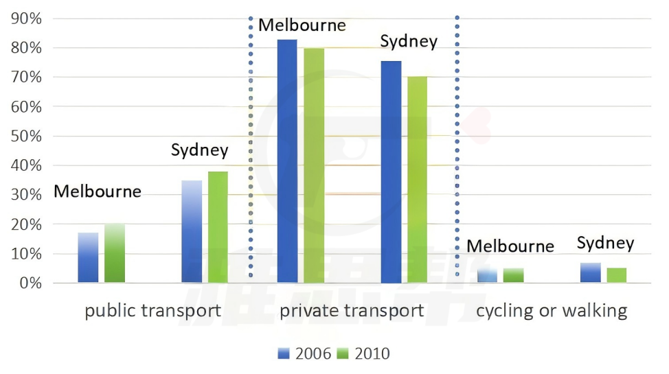
The bar chart below shows the percentages of people choosing different ways to go to work in two cities in 2006 and 2010.
Summarise the information by selecting and reporting the main features, and make comparisons where relevant.
题目来源:2025年4月26日大陆雅思小作文
1、题目大意
下面的柱状图显示了2006年和2010年两个城市选择不同上班方式的人的百分比。
2、高分范文示例
开始段 - 改写题目+总结
The bar chart compares the percentages of commuters using private vehicles, public transport, and walking or cycling in Melbourne and Sydney in 2006 and 2010. Overall, private vehicles were by far the most common means of travel to work in both cities, whereas walking or cycling accounted for the smallest share of commuters. Over this period, the use of public transport increased moderately in both cities, while reliance on private transport declined slightly.
第一段 - 最多和最少
In 2006, just over four-fifths of commuters in Melbourne travelled to work by private transport, compared to roughly three-quarters in Sydney. By 2010, these figures had dropped marginally to about 80% in Melbourne and 70% in Sydney. In stark contrast, only a very small minority of people (under 10%) in either city commuted on foot or by bicycle, and this figure remained virtually unchanged from 2006 to 2010.
第二段 - 增长的公共交通
Meanwhile, the proportion of commuters using public transport grew in both cities. In Melbourne, the share of commuters taking public transport rose from around 17% in 2006 to 20% in 2010, an increase of approximately 3 percentage points. Sydney already had a higher reliance on public transport at around 35% in 2006, which climbed to about 38% by 2010.
必备语料
means of travel 出行方式
the most common mode 最常见的方式
accounted for the smallest share 占比最小
reliance on private transport 对私人交通的依赖
declined slightly 略微下降
remained virtually unchanged 几乎没有变化
in stark contrast 形成鲜明对比
proportion of commuters 通勤者的比例
moderate increase 适度增长
climbed to 上升到


